I witnessed a presentation of excellent thinking by a respected marketing strategist this weekend that did not make it onto the PowerPoint slides with equal impact. The spoken words were brilliant -- but most of the audience got lost inside the experience of poor visuals.
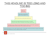
The slide to the right is a fair example of what was on-screen. Overly large headlines, underlining, unbalanced use of space, mismatched and multiple colors with no meaning, misaligned text, and way too many words for anyone to follow.
This was a presentation about marketing and the presenter was discussing the virtues of developing a complete branding program. If I did not already know how brilliant this person is I would not make a choice to hire based on this moment.
Throughout the presentation all I could think about is how the presenter could have fixed the slides to better match the message, the audience, and the brand of the presenter.
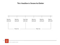
To the right is the same slide from above, reformatted in a simple fashion, to better present an idea (the original slide was a step-by-step time progression).
The great thing about PowerPoint is that it is a simple tool to use -- no graphic training required. But it does require the operator to think a bit to use the tool correctly.
I will say again, no matter how intelligently you speak, if your graphics are amateur the audience will have a hard time believing you are an expert. Here are a couple of quick tips for creating a better impression even if you are not a graphics genius:
- Never put on a slide all of the words you wish to say.
- "White space" is your friend! The less the audience reads the more they are listening to you.
- DO NOT EVER UNDERLINE! Just a quick lesson from Graphics 101.
- Use color sparingly. One color, even if black (on white), is far easier to read than multiple colors with no meaning. It's not a party -- it's a presentation!
- Pictures are always better than words in presentations. Period.


