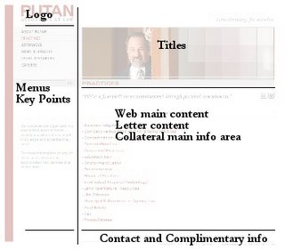
 To help unify the brand message delivered by any marketing element we needed a graphical grid that would serve as the design foundation for everything we would create.
As a beginning we determined that our grid should allow for large open spaces between page elements (white space). To a point I believe increased white space equals more comprehensible information.
We also determined that our grid should be usable across everything and anything we created. Not just collateral, but letterhead, envelopes, cards, notes, web, PowerPoint's, etc.
As an example, look at a web page, strip away all content except logo and complimentary information and you are left with a close match to our letterhead. Strip away everything but logo and title area and you have a close match to our cards. To do this we had to make choices about what information/elements went where, and, we had to make layout rules for each grid section. With limited exceptions we use flush-left in all grid sections, and have assigned fonts, weights, colors, content, etc.
All graphical elements must be "living" images; Real people and object photography. Charts and graphs have templates as well controlling the color pallet, callouts, line weights and information flow. Everything conforms to the base grid.
Since we were creating a grid standard that has to communicate our message whenever it was used we also had to consider how it look in two years and in ten.... Like a classic Brooks Bros. suit, would it be wearable down the road as the firm, information, and people changed? For this reason we stuck with simple layout choices, tailored to us of course, and avoided any bling or flair ("new this year" stuff).
In the end we did arrive at a very flexible, unique, wide open, classical grid and so far it is performing quite well. What it will generate is a family of marketing elements that are familiar and friendly to our audience.
Technorati Tags: Legal Marketing, Professional Services Marketing, Marketing, Business Development, Sales